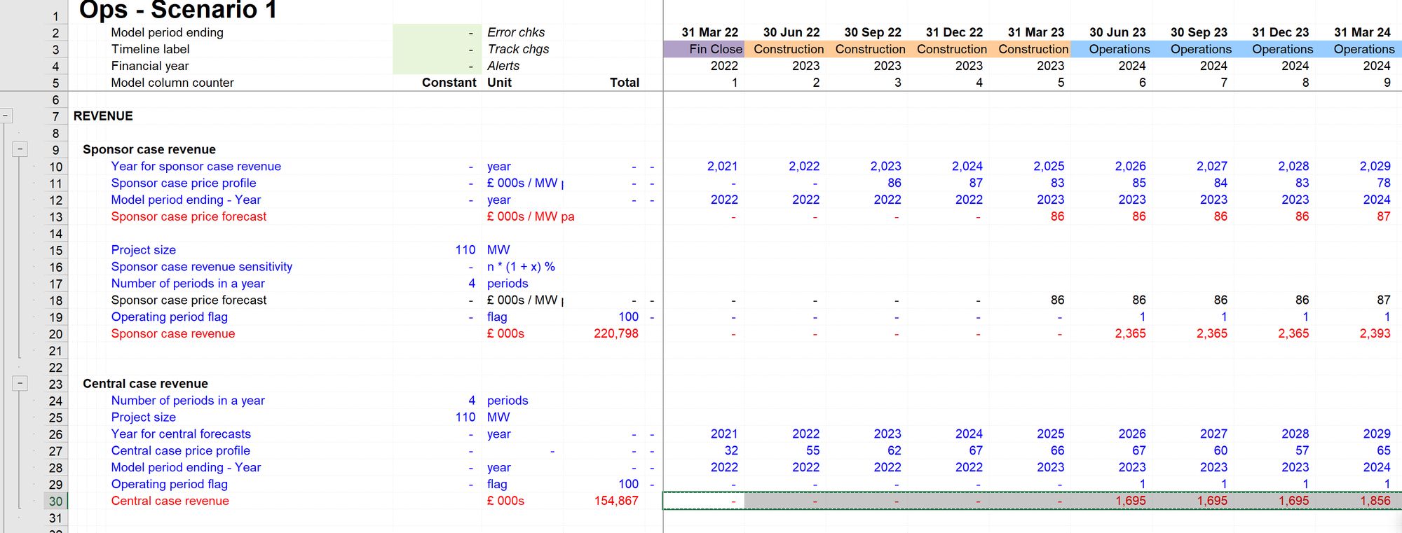
Core modelling skill 11: How to create a quick chart
Download the reference file to practice:
To obtain the worked example file to accompany this chapter buy the financial modelling handbook.
What's covered in this chapter:
How to create a quick chart using F11
What you’re looking for in the chart
How to add additional line items to your chart
How to customise the F11 quick chart
We build models to understand more about the businesses that we are modelling. And in understanding more about them, we can take better decisions about those businesses.
The model will tell us things we didn't already know about the numbers. If it didn't, there would be no need for us to build the model.
Therefore understanding the numbers is a crucial aspect of modelling.
And the best way to understand the numbers is to see them in a chart.
Eyeballing the numbers themselves is valuable - but it doesn't show you the patterns and the trends the way that a chart will.
Quickly creating a chart of any line item in the model is a core skill.
How to create a quick chart using F11
Step 1: Select the line you want to chart.
Start from column J
Ctrl+Shift+right arrow to select the numbers
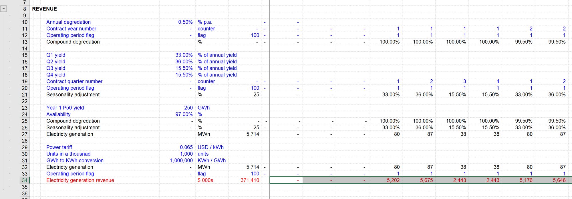
Step 2: Hit F11 to create a quick chart
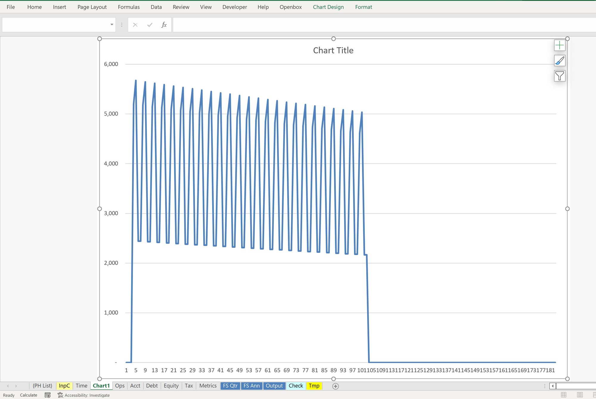
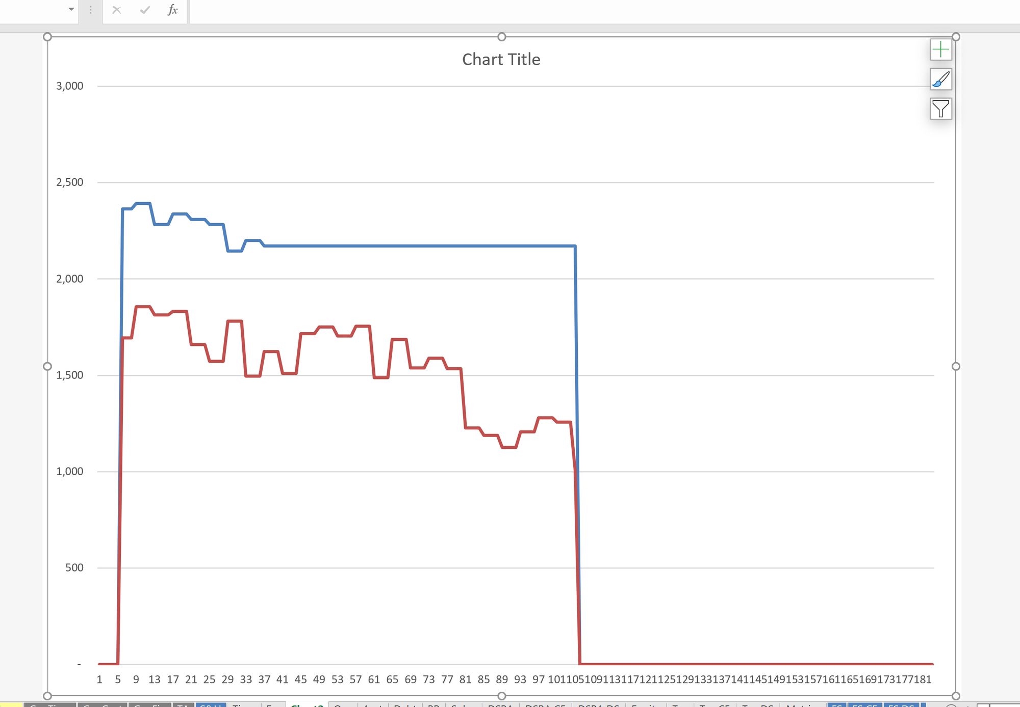
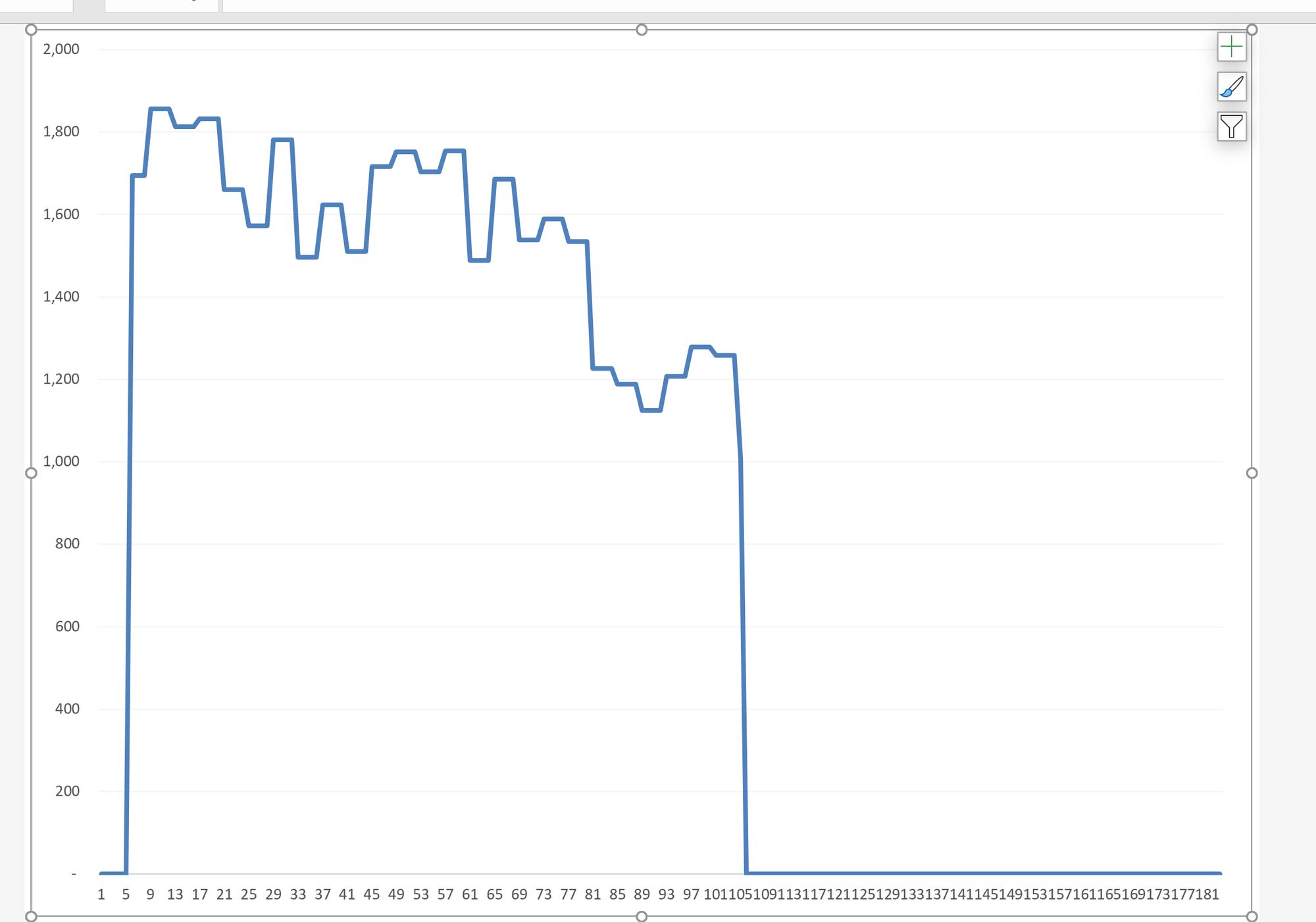
Step 3: Understand the chart
See below for more on what you're looking for in charts.
You will sometimes see things in that Chart that causes you to want to review the numbers in more detail. The Chart only gives “column numbers” along the x-axis. I recommend keeping “Model Column Number” somewhere in your sheet header block. That way, when you see something in the Chart is a specific column, you can link that column back to the correct column in your calculation sheet. For example, in the Chart above, you may want to see what’s happening in the last period - you can see that this is around 104 in the model. You can use the Model Column counter in row 4 to locate the correct column in the calculation sheet.
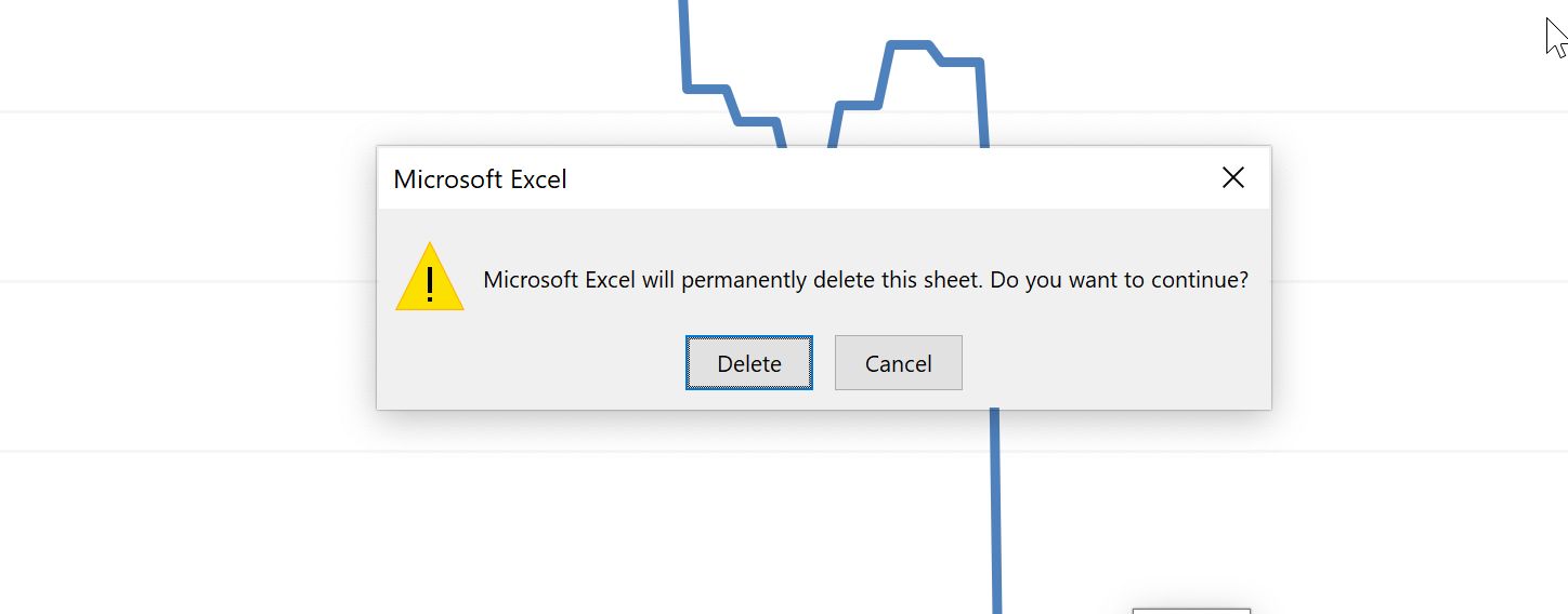
Step 4: Delete the chart.
These "quick charts" are not intended to be something that you keep in your model. They are a quick look at the numbers to understand what's going on in your model. Use them regularly, quickly, and then get rid of them.
The native Excel keystroke for deleting a chart is quite cumbersome:
There is, therefore, a Productivity Pack shortcut for deleting a sheet:
We have added a quicker keystroke for this to the Productivity Pack because our goal is to make it easy to add a chart quickly and then get rid of it just as easily.
Note: there is no undo after deleting a sheet. Therefore make sure you are always looking a chart when you use this delete sheet command!
What you’re looking for in your chart
As you review your charts, you're looking for any discontinuity in the trend. Chart discontinuities take one of three forms. Often these will occur together.
Your understanding of these chart features should be commercial: what is happening in the business to cause the features you see in the chart.
1 Changes in slope
2 Sudden step-ups or step-downs
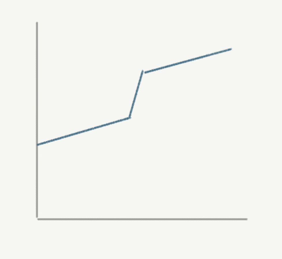
3 Spikes
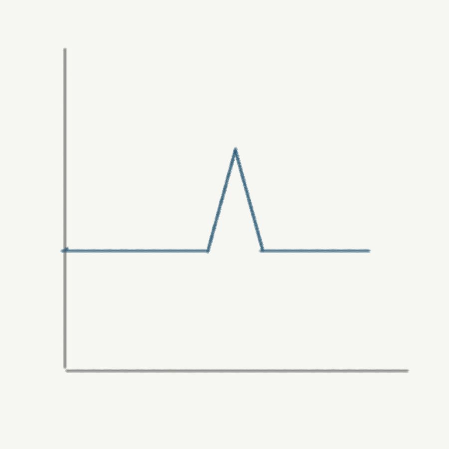
Often you will not have been aware of these anomalies in your data before charting. It's so much better that you discover them before presenting the model or the data. It's never a good look when somebody finds an anomaly in your data, and you don't have an explanation. Chart regularly while you're building your model. Your understanding of your numbers and your model will be much better.
As you are figuring out what's causing these discontinuities, beware of your inbuilt tendency to accept the first explanation that “sort of” fits the data. This happens because your brain is keen to escape from the discomfort of not knowing. Consider every possible explanation as a hypothesis. Find a way of testing it to increase your confidence level.
How to add additional line items to your chart
Sometimes it can be helpful to have several items on our chart to compare them.
In this example, we have two revenue profiles, a "sponsor case" revenue (the optimistic case) and a "central case" revenue profile based on data from external advisors.
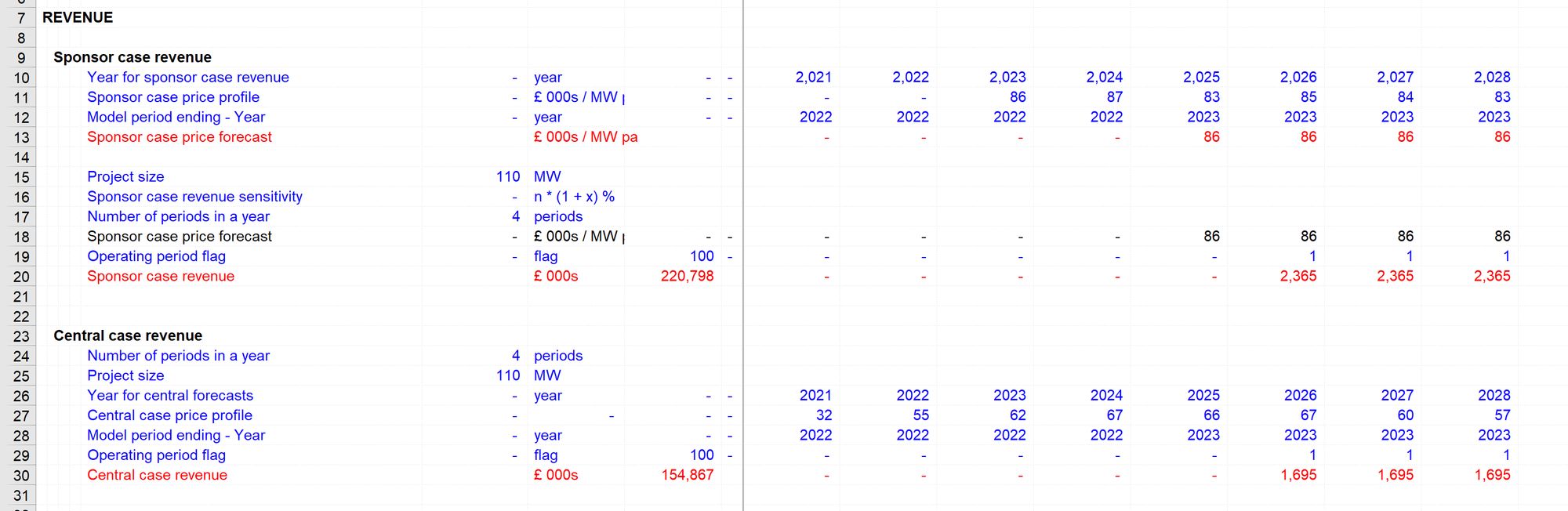
The row totals already, usefully, tell us the difference in the revenue totals. But just looking at the numbers going across the page doesn't give us a sense of the differences between the profiles.
We begin then by charting the first line as usual. We select from column J then hit F11:
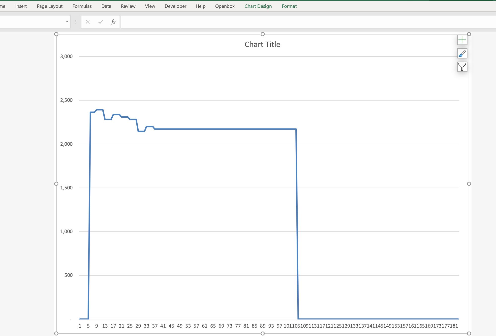
To add our second line, we repeat the process. Select from column J on the second data series we want to chart:
Copy the data, using Ctrl+c.
Then, instead of hitting F11, go back to the chart you created and paste the new data in, using Ctrl+v. Like magic, the second line appears.
How to customise the F11 quick chart
If you have never changed your default chart, it's likely that when you hit F11, you get a Column chart like this one:
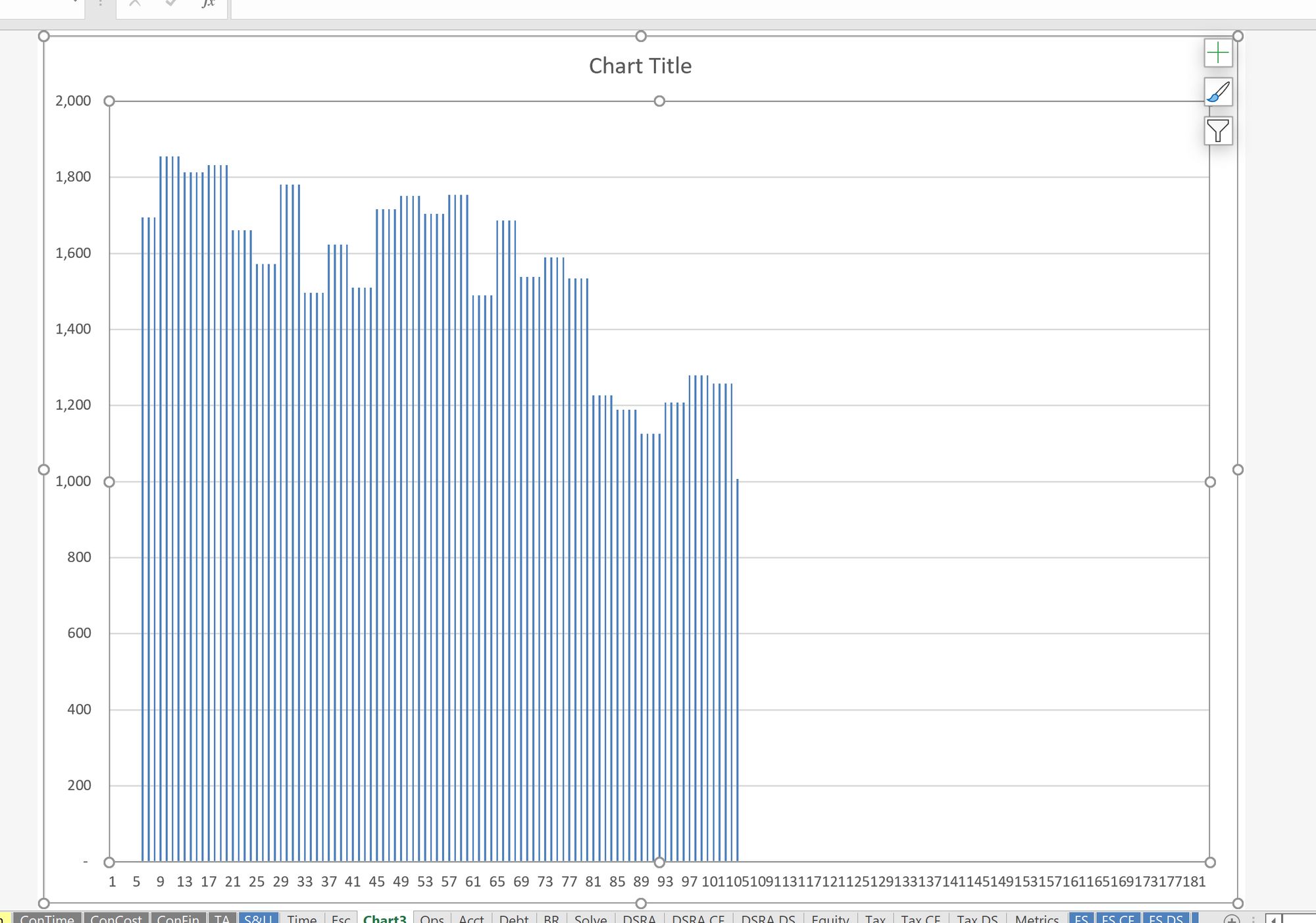
There's nothing wrong with this chart type. It may be your preference to keep it as it is. I prefer a line chart as it shows trends better.
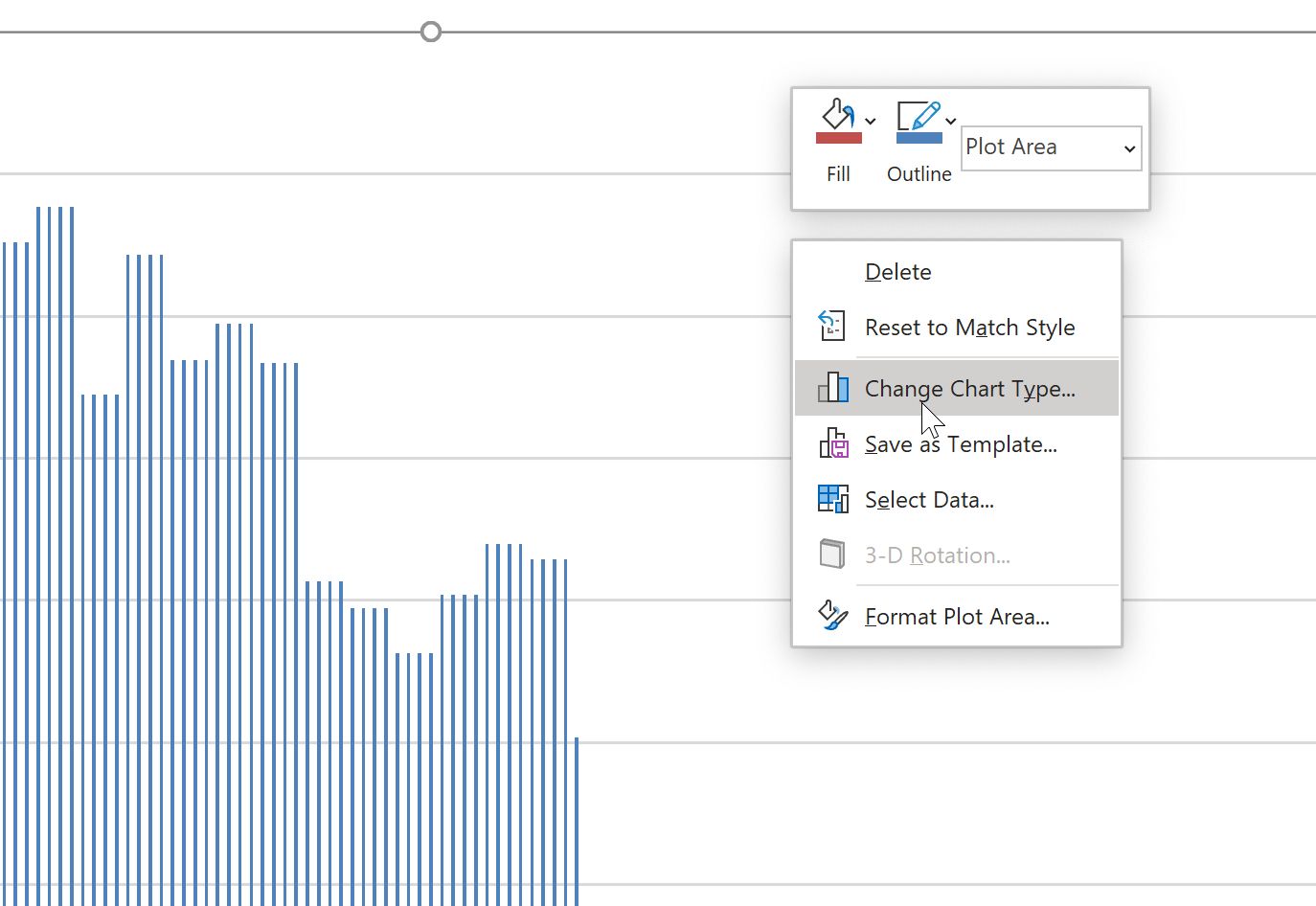
To change the default chart, first create a chart using F11 as above.
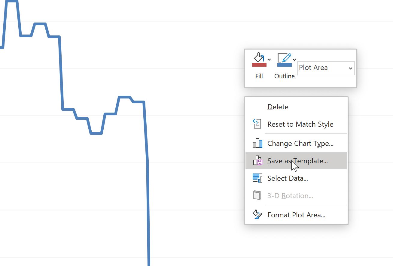
Right-click on the chart, and choose Change Chart Type.
Select the chart type you want. Customise the chart as you wish. I want to minimise the visual weight of the gridlines and increase the prominence of the chart line:
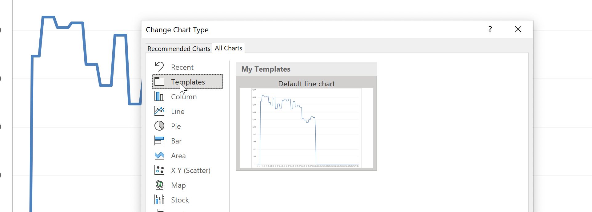
Once you are happy with your chart, right-click again, and this time select "Save as template".
Give your chart a name. I have called mine "Default line chart".
Now, go back into the chart design dialogue. (Right-click and choose Change Chart Type). This time, choose Templates. You should see the chart that you just saved.
Right-click on that chart. Sorry, there is a lot of right-clicking in these instructions.
Now choose "Set as Default chart".
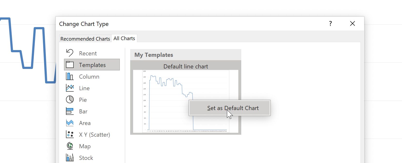
Now, whenever you hit F11, your default chart will magically appear.
An alternative to using the Quick chart is to add a sparkline to your calculation. With a sparkline, you can always see the visual profile of the numbers.
See: How to add a sparkline in Excel with a single keystroke

Comments
Sign in or become a Financial Modelling Handbook member to join the conversation.
Just enter your email below to get a log in link.